
UX research, App Design
UX/UI Designer
74 hours
Prototype
Meal planning is a common task for most home cooks, including myself. So, the opportunity to transform this personal challenge into a practical solution for others made this project particularly gratifying.
What distinguishes Cookit from the array of other solutions I explored is its commitment to simplicity and user-friendliness while integrating all essential steps of the process. One of Cookit’s features that makes it particularly unique is its budget-conscious and collaborative grocery list—a rare attribute among its competitors. This feature not only sets Cookit apart but also aligns perfectly with the practical needs of everyday users.
Throughout this project, I leaned heavily on research results in my decision-making and prioritization, keeping the Design Thinking structure in mind. My research modalities included:
I talked to 7 adults, ages 23-43, five experienced and two less experienced cooks to understand their regular frustrations when meal planning, their tools, and their expectations.


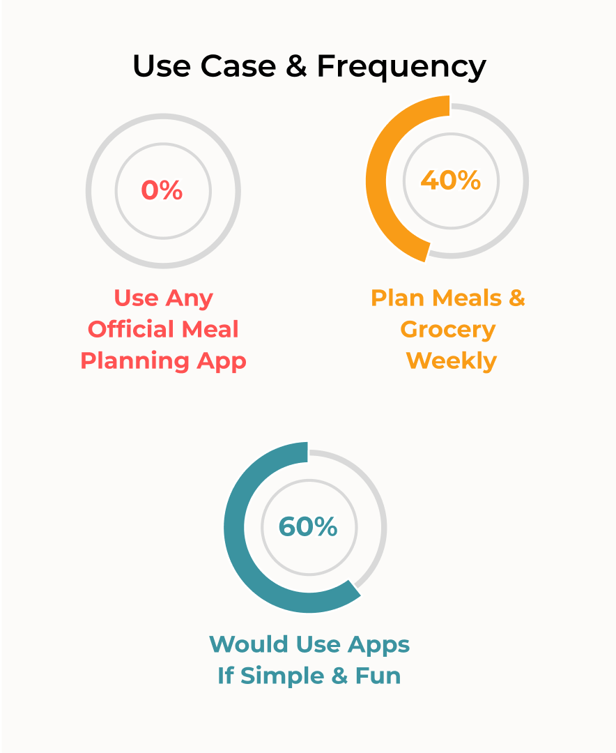
0% of the interviewees actively used apps for meal planning so I could not collect any data on the competitor apps from user perspective as I had planned in my research plan. However, it intrigued another question: What makes these people not want to seek a meal-planning app yet?
There are many meal-planning apps on the market. For the purpose of benchmarking, I chose apps rated above 4.3 stars and with numerous reviews indicating popularity.


Grocery list
Recipe center
Collaboration capability
70% of participants struggle with managing grocery coupons due to time constraints. let’s tackle this!
Users need to easily customize meal-planning detail level. Goal is to find a balance.
With a clear idea of the essential information for the minimum viable product (MVP), I began designing the optimal, intuitive information architecture. To achieve this, I set up a virtual card sorting activity using The Optimal Workshop tool.
Due to the limitations of the free version, only 20 topic cards can be added, whereas a preferred 30 or more would be beneficial.
1. As voted by participants the topics fit best into 4 main categories:
Grocery-related topics
Recipe-related topics
Planning-related topics
An account Section

2. And the app navigation flow would look as follows:

Inspired by my research insights, I brainstormed core brand value words and generated name options for the app using Namelix. After gathering votes from potential users, I decided on "Cookit" and moved on to logo design:


Based on testing usability with 9 participants aged 20-40, including some of my original interviewees, the following results indicated that I was able to get close to my initial design goals:
Task 1:
The user creates a new weekly menu and adds it to meal plan
Task 2:
The user adds a new recipe to the recipe book
Task 3:
The user finds a new recipes using the search feature and adds it to recipe book
Task 4:
The user edits and finalizes the grocery list : Assigns people & stores to each item
I also created storyboards to visualize Alejandro and Raya's app interactions. I used the insights to adjust user flows to reflect real usage and develop relevant testing scenarios.
Stated by 70% of the testers
86% of the testers voted
100% of the testers complimented on these
The multi-function add button created confusion for 75% of the testers, so I replaced it with function-specific buttons for each screen


Lack of context on the “menu creation” screen confused 55% of the testers hence the description was added.


The recipe addition flow confused 65% of testers, primarily due to the multi-function ADD button which I fixed . For more clarification, I implemented the following additional changes:


Also added confirmation effect after a new recipe is added to the recipe book, by giving a darker background effect to the newly added recipe:


For the sign up and account set up process
-1.png)