
UX research, UX/UI Design , Web Design
UX/UI designer
40 hours
Prototype
After hearing great things about the food and ambiance of this new local Mediterranean/Persian infusion restaurant, I was intrigued to learn more and decided to check out their website. After a few clicks, I quickly realized that major improvements were needed. I tried to send an email through the website's contact link, which was broken, so after adding a “checking email link” to my list of improvements, I called the restaurant directly and set up a meeting with the owner.
During our meeting, I shared my thoughts and ideas on how to improve their website. He shared that a nonprofessional friend created the website using a Shopify template.
I was impressed by the owner's enthusiasm and willingness to make changes to their business. It was good timing, and I felt humbled when he gave me positive feedback on my first round of high-fidelity screens and asked me to take the project to the end and ship my designs to their live website.
The core of my process for this project was research, testing & collaboration with the client, aiming to create a new user-centric design while staying relevant to market requirements.
During a busy lunch at the restaurant, I approached customers willing to talk. Some preferred to schedule interviews for another time. I recruited five participants: three during their meal and two at their convenience. Both sets of interviews provided valuable insights for my research.


In assessing competitors, I aimed to criteria based on thorough research, prioritizing the intersection of business and user needs. This ensured a comprehensive evaluation that illuminated the most prominent aspects crucial for success.

To decide on the new sitemap, I used Optimal Workshop for a tree testing exercise with 7 participants. The results helped me edit and rearrange the information architecture, leading to an improved sitemap
.gif)
To keep up with the users' needs throughout the project, I created two personas—Dave and Amin based on the information from research. Amin represents those familiar with the restaurant's food type, while Dave represents the food adventurers who would be trying the food for the first time. I assumed these two groups would represent the general demographics of website visitors.


I also created a few storyboards to visualize users interacting with the website, capturing insights for my solution through this empathetic process.

Having all the above in hand, I felt comfortable moving on to Figma for wireframes. However, before high-fidelity screens for testing, I set another meeting with the client to discuss my suggestions on visual styling. Our Final Decisions are listed Below:
The right shades of blue and gold were chosen for the website
The color selection was inspired by the restaurant’s interior and was evaluated for the best accessibility


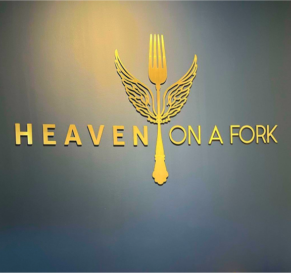


The client's original logo was modified by removing the fork, as it appeared disproportionate and was not cohesive with the navbar design
It was decided to incorporate the fork as a separate element in the interface design
Food enthusiasts ages 30-40. The group included single and married individuals who usually dined out or ordered food 1 to 4 times per week.
30% success rate in achieving the overall UI goals (being minimalistic, elegant, and easy to navigate)
100% success rate with multiple access paths to the “Delivery Order” page


100% success rate with catering page access path from navbar/hamburger button
20% success in presenting the information on the catering page. Second testing is required to measure the success rate after iterations
Catering flow AFTER the iterations: Added the descriptive page, added the progress bar
During ideation, I introduced the "Pair well with..." feature, suggesting food pairings for each menu item. It boasted a 100% success rate during usability test.


Design mobile and desktop screens to introduce the chef and food’s ethnic background
To test The new About page, new catering flow and the overall experience
Transfer the new designs to Webflow , and move hosting
-1.png)